Recent Animations of Traffic Flow
Jon Reades, Joan Serras, Ollie O’Brien and Martin Austwick in CASA have done a good job recently in visualising urban flow systems which are central of course to our science of cities. The key feature of the flow data that we have is that we have it as volumes of activity between nodes which are origins and destinations with the paths between the nodes usually being considered as straight lines in the animations. The data is not on spatial – we do not simply visualize the peak hour flows but we examine these over the diurnal cycle – the 24 hour period.
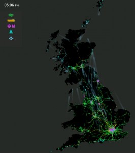
First we will take a look at different public transport networks visualized over the UK. Joan Serras has developed these flows for different modes of public transport from publicly available timetables using Open GL. he has taken the data from the publicly available National Public Transport Data Repository (NPTDR) where they have also posted his animation. There are two applications for the UK and then below this there is the application for greater London which is our real focus of interest in terms of urban land use transport models. Click on the pictures below to launch the media and watch the movies. The movies are low res and in Vimeo – trying to find better ways with higher res but these suffice for the moment
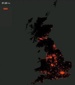
 Bus Travel throughout the UK All Public Transport throughout the UK
 The movies that you can click onto to the left displays all movements in the public transport networks through 24 hours in Greater London. What these movies show is the timing of these movements with long distance coaches starting earlier in the day and moving all night which is true for some heavy rail but with tube and local bus starting around 6am and peaking at the usual journey to work and journey to home times, the morning and evening peaks.
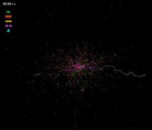
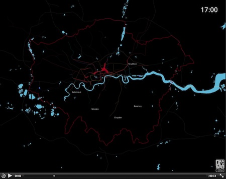
We then explore the rail data that is from the Oyster card data set we have. Jon Reades is mining this data and has a great visualisation of flows between 666 nodes defined by the tube and overground rail system. Of course, from flow data we have activity data as the summation for origins and destinations, the out-degrees and in-degrees in graph theoretic terms and we are examining the dynamics of these using ideas in scaling and fractals but that is another story, another country. Click below to see Jon’s animations of 24 hour diurnal flow in London.
Our Oyster card data set records all travel in Greater London on public transport – tube, bus, light rail, and heavy rail – which is recorded when a user swipes their card at an origin and again when the check out at a destination. This is more or less complete for rail data but not for bus where there is no swipe out. For much heavy rail however the swipe out is disabled.
Nevertheless we can extract good data between 2206 nodes in Greater London and using shortest routes between these nodes we can assign this data to origins and destinations, thus building up a picture of travel. Jon has produce a movie which shows the movement between segments between adjacent nodes or stations, which represents the flow as a system like a heart that pulses on a diurnal rhythm that reflects morning and evening peaks. There is much to say about this representation but at this stage we are in an early stage of research and interpretations. Here below is the move of the 24-hour day in terms of these modes of transport and their flow in Greater London.
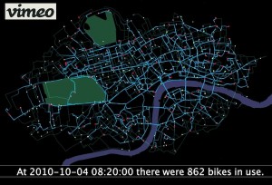
Our last animations for now are first from Martin Austwick who has used the same language as Jon Reades – Processing – to simulate the flow of public bikes in London from the scheme set up one year ago (2010). Over a 24 hours period, each bike is plotted. This is less a flow map of aggregates but one of the individual objects – the bikes themselves – which build up and give the impression of motion. There are very clear issues in defining the level of temporal aggregation in these kinds of flow map as distinct from the sort of maps produced with the Oyster card data above.
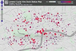
Ollie O’Brien, CASA s expert on public bikes schemes around the world (see his web site) has plotted the number of bikes (the origins and destinations) at a sequence of times during the working day for London. This is a map of the changing in-degrees or out-degrees merged as one. The plot is on a strike day for the London subway in September 2010 but the import of this is how we can animate flows or in this case their summations. The flows are on the left and their summations in the bike docks on the left. Both Vimeo images. Click on the images below to get the relevant Vimeo animations.
 Animations of Public Bike Movements Animations of Changes in the Bike Nodes: Docking Stations
 Martin has explored how we might use force graphs to display clustering and related properties in such graphs. If you click on the map to the left, then you can drill down to find out how such graphs are produced from the Vimeo site. He has a couple of versions there for you to explore and if you’re appetite is whetted, go to the Networks pages on our site.